Merchandising your online store
Getting the most from selling online
Part one: Merchandising your online store
As more and more people get in the e-commerce action it’s important to remember how it all started. Shops and stores showcased their products, built their reputation, looked after their customer base and spread the word.
Although as technology and behaviour changes, and a whopping £133bn a year is spent online, has the philosophy behind retail success really changed at all? Or have popular e-commerce stores taken the essence of what works on the high street and simply delivered these values online?
It may seem like a whole new ballgame but the principles of our offline shopping experience remain steadfast in our experiences online. Utilising these principles in the online world will help you get the most from your website:
- Merchandising your online store
- Credibility and trust
- Customer experience
- Making yourself known
Merchandising your online store
Seeing as your product is the star of the show, today we’re going to start with #1, merchandising your online store. Let’s begin by checking off some important tips to help you showcase your swag.
Real world example of e-commerce merchandising done well
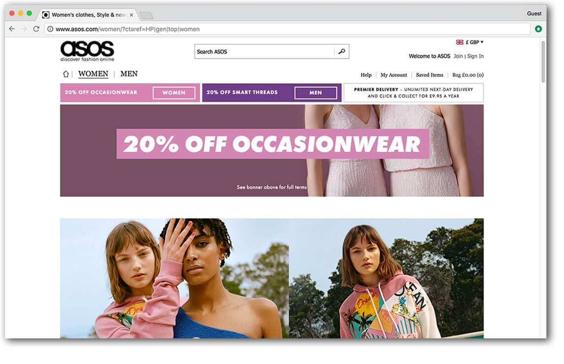
 Online fashion retailer asos.com do pretty much everything right. The site is oozing with aspirational lifestyle images, detailed glamorous product images and cat walk videos.
On the one hand they face a significant challenge. After all, traditionally people like to browse a store and try clothes on. But on the other hand, they have the advantage of tapping into an emotive subject, fashion. Or even deeper, public perception and self image.
How important is photography to my webshop?

When you’re in a real shop, you see the item how it is. Not a small blurry version of it. Seeing is believing. So a lot of effort needs to go into reproducing that visual experience.
You’ve been on gumtree or eBay. The items with the best and most photos stand out. The ropey photos make you think twice. So it’s no surprise that e-commerce sites with great product images outperform ones without.
Good photography improves the perceived quality of your product, can communicate lifestyle values and increase how credible and trustworthy your site appears. We suggest you get a professional photographer to help. It’ll be a smart investment long term. You can use the photos in your marketing, as well as on your product pages.
We can arrange professional photography for you or make a local recommendation. However, if you do not have the budget available right now, you can always shoot the images yourself. Just be sure to consider your lighting and backdrop. Whether you’re using your smartphone or a decent camera, set up a mini studio. Use a tripod, lamp and studio tent. Aim for good light, contrast and consistency. No blurry images, kitchens, bathrooms or unrelated objects in sight!
What product descriptions work well?
Paint a picture. Quality product descriptions help get the sale over the line. They are also very useful for search engines. So your goal is to have words that not only describe the product, but go beyond that.
Sure, list the features, but what are the benefits?
What problem does the item solve? How does it make you feel?
The ‘feature’ of a toy product might be ‘batteries included’. The benefit is that the child can start playing with the toy straight away. Avoids the tears from disappointed littl’uns. Avoids frowning parents making an impromptu dash to the shops.
Tell stories about the product and use words that describe how it sounds, smells, feels, looks. These things will all help elicit an emotional response from the reader.
Scattered throughout this explanation should be a few choice keywords, for search reasons. But it’s important this sounds natural, like a real person would actually say it. No broken English or robotic sounding phrases – this will just put your buyer off.
When you walk around a shop, you don’t read every bit of information, it’s impossible. You scan for bitesize info that you can quickly act upon. This applies online too. So Use headlines, subheadings and bullet points within your description to make your text easier to pick out and absorb.
Does my e-commerce site need product reviews?

It helps, yes. Social proof. Just like in the real world, people are way more likely to believe what someone else has said about a product over what you’ve said yourself.
Especially if that someone has already bought and received the item. Did you know, 61% of customers read online reviews before making a purchase decision?
And if people are on the fence between a couple of options, they’re likely to go for the one with the most positive reviews. In fact, 50 or more reviews per product can lead to a 4.6 increase in sales.
What other information will help people buy?
It’s summer, you want to get fit and spend more time with the family. So find yourself meandering round a bicycle shop scouting for bikes for the family. It’s understandable that you might want some advice to help you decide what bikes suit you best.
Online, in the absence of a smiling sales assistant, your web shop needs to compensate by offering useful guides matched to expected customer queries.
In this instance, you’ll want to have content that explains what type of bike suits your usage, and especially a size guide. Content might be articles, illustrations or videos and could cover things like:
- FAQs,
- Size guides,
- Comparisons,
- Performance charts,
- Instructions,
- Assembly guides (if it’s simple!)
What type of video drives e-commerce sales?

Have you heard of the term ‘showrooming’? That’s where potential buyers peruse the high street shop to browse before hitting the internet to find the best deal online.
But reverse showrooming, or ‘webrooming’, occurs when customers browse online but head to a bricks and mortar shop to complete their purchase. There is an increased risk of this when your website either fails to provide enough information about the product. Or the consumers desire to see the product in action isn’t met.
There’s no better substitute for actually being there than video. Until AR/VR takes over then it’s the best thing we’ve got to demonstrate what the product looks like and how it’s used. Videos that showcase product dimensions, as well as product functionality tend to be really helpful.
Ultimately, it’s good to have video because tests show product videos help sell more.
What’s more,
- 71% of shoppers think video explains the product better
- 58% think companies with product videos are more trustworthy
It doesn’t have to be complicated or expensive. The videos on asos.com are simple but effective. They film the model wearing the clothes marching glamorously onto the set, ready to take the photos. Two birds, one stone.
As a guide shorter videos work best. But although reviews are generally a good thing, research has shown that videos of someone reviewing a product, tended to be a flop with the audience.
How can I design my website to upsell more products?

In stores, product placement is important. Items are often grouped together or advertised as a bundle. Coffee pods by the coffee machines, matching bathroom decor, a discount on shaving products with purchase of razor, that sort of thing.
Plus we are bombarded with last minute impulse buys. Whether it’s batteries by the conveyor belt or the friendly sales assistant on the till. How often have you been asked to consider something extra that you hadn’t originally put in your basket? We heard about one petrol station asking their customers if they’d be interested in the chewing gum deal. Possibly a bit rude. Gum, anyone?
But it works and that’s why they do it. Your website can do this even better, because it can offer a never-ending array of products to you, without getting annoying. Imagine someone at the checkout offering you one product after another, how annoying. And yet your website can display dozens of products throughout the customer journey. As you browse the pages, as you add items to your wishlist and basket, it can follow you around saying “Wow, great choice. Why not get this with it? Other customers bought them together you know.”
What makes an effective webshop category page?
Supermarkets and department stores organise their goods into sections, aisles and departments, so shoppers can make better sense of it all. It helps people find what they want quickly, immerses them in a relevant environment, and adds an element of control to the customer journey.
This is where your category pages come in. They add structure, navigation, enjoyment and momentum to the shoppers journey.
Good category pages will introduce shoppers to subcategories, holding their hand through the journey and guiding them effortlessly to the products they are looking for.
Make sure you use enticing images and descriptions. They will be useful and reassuring for your visitors and also a great place to put your key search terms, ready for those googlebots to find.
Include a customer service bar at the top to build trust. This section could feature a phone number, free delivery message and hassle free returns badge. Don’t overload it with too much info, just enough to reassure the buyer and nudge them along.
How can I keep on top of stock control?
High street stores have limited space. Efficient stock control is the key to having the right amount of stock in the right place, maximising the opportunity for sales.
Most ecommerce platforms have systems in place to help you stay in control of stock levels. But what if you have a physical shop too? How can your till, website, and inventory software keep talking to maintain a healthy stress-free relationship?
If you have an epos now or datasym system, we can help connect your website to your epos equipment and automatically synchronise stock levels between your web shop and your retail stock.
- We’ll import your products from your system
- Review products, add images and detailed descriptions
- Sync your stock levels automatically
- When you sell an item, the stock on your till is automatically updated
- Get paid into your merchant account and process the order
- Despatch or allow ‘click and collect’ and send email notifications to clients
Contact your local studio to get started.
So you see, the values embedded in successful bricks and mortar retail can be harnessed to great effect online, where the potential for sales is greater.
Hope you found part one useful. Coming next, part two, building trust.
But for now, in the words of retail, ‘Thanks, please come again’.


Trackbacks & Pingbacks
[…] Onze engelse collega’s hebben hier een fantastisch artikel over geschreven. merchandising your online store. […]
[…] We published a whole article about merchandising your online store. […]
Comments are closed.