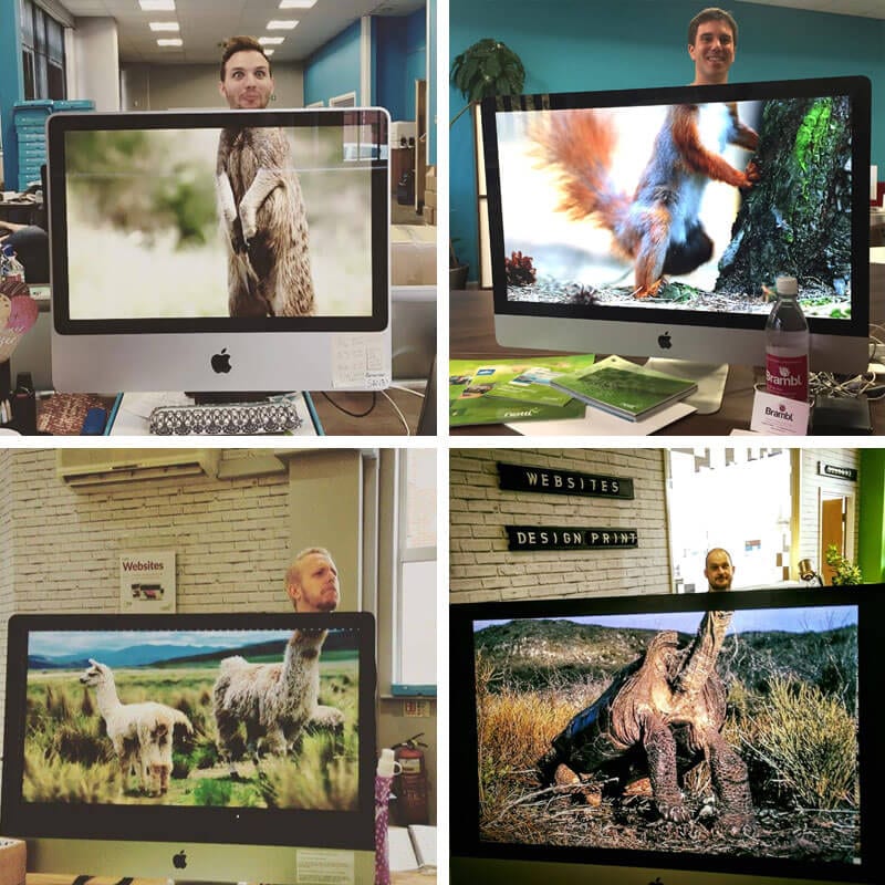
It’s Friday, and the smartest way to finish the working week is to use your head, or more precisely, your Nettlheads.

We’re offering the chance to win £1,000 towards a new website by uploading a photo to Facebook or Twitter using the #nettlheads tag. We’ll pick the best photo at the close of play next Friday, so get posting.


nettlheads

Terms and conditions: £1,000 grant towards the cost of your website.No cash alternative to the prizes will be offered. The prizes are not transferable. Prizes are subject to availability and we reserve the right to substitute any prize with another of equivalent value without giving notice. Redeemable at participating outlets only. Winning entry picked 5pm 18th December 2015. There is no entry fee and no purchase necessary to enter this competition. No responsibility can be accepted for entries not received for whatever reason. The promoter reserves the right to cancel or amend the competition without notice. Any changes to the competition will be notified to entrants as soon as possible by the promoter via social media. Entry into the competition will be deemed as acceptance of these terms and conditions. The winner agrees to the use of his/her name and image in any publicity material. Any personal data relating to the winner or any other entrants will be used solely in accordance with current UK data protection legislation and will not be disclosed to a third party without the entrant’s prior consent. The winner will be notified by email and/or letter within 28 days of the closing date. If the winner cannot be contacted or do not claim the prize within 14 days of notification, we reserve the right to withdraw the prize from the winner and pick a replacement winner.

Jack-Me-Off

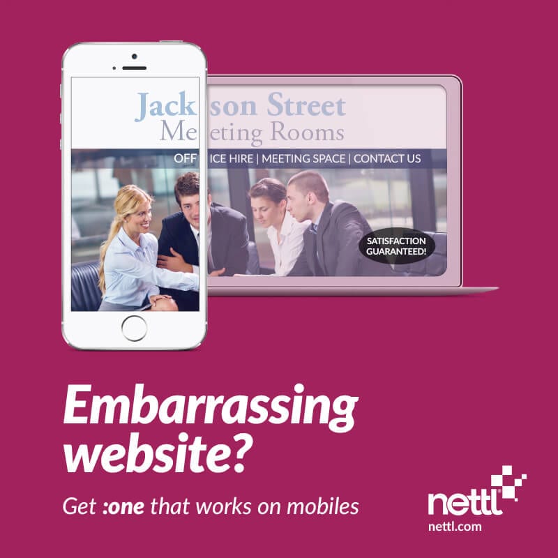
Ok so maybe your website isn’t as embarrassing as Jackson Street Meeting Rooms, but does it work properly on your mobile? Do you need to pinch and zoom and pan and scale? If you do, then so do your visitors. And that’s awkward. It could be losing you business.

Take a look at your site now on your phone. Now look at your competitor’s. Is your site easy to navigate? Is theirs?

Why does it matter? Google are now ranking sites which work on mobile higher. So if your site doesn’t, then it could be being pushed down the rankings.

Why are your visitors arriving at your site anyway. Do they want to make a booking? Probably. Can they? Can they buy online? Can they make a reservation? If not, what’s stopping you? These days, your customers want to interact online with you. We can help you do the things your customers want to do.

Nettl now has over 25 neighbourhood web studios across the UK and Ireland. Find your nearest studio and let’s get started. Pop-in or call us to book a free consultation and we’ll talk about what you’d like to do.

We’re on the lookout for new talent – Check out the latest job vacancies

We always have an eye out for exceptional talent, and at the moment we have three positions we need filling. We’re on the lookout for brand stylists to join our Birmingham, Exeter and Swansea studios. Check out the current job vacancies at Nettl below.

Designer/Brand Stylist

We’re looking to add to our growing design team. Brand stylists should not only have a flair for creativity but also the ability to liaise with clients and potential clients and build working relationships.

Brand stylists create solutions for a huge variety of products and activities, such as websites, advertising, books, magazines, posters, apps, product packaging, exhibitions and displays, corporate communications and corporate identity, e.g. giving organisations a visual ‘brand’.

Our brand stylists produce artwork that reflects the brief agreed with the client, develops creative ideas and concepts, choosing the appropriate media and style to meet the client’s objectives and produces graphic files that meet with the specifications of production.

The work demands creative flair, attention to detail, up-to-date knowledge of industry software and a professional approach to time, costs and deadlines. The ability to prioritise jobs and demonstrate WordPress/web skills is essential. Applicants should include working examples of sites they have worked on and be able to discuss their involvement in these projects.

Activities

A brand stylists job may involve managing numerous design briefs at a time, allocating the relevant amount of time according to the value of the job. Typical work activities include:

  • Meeting clients to discuss the business objectives and requirements of the job;
  • Deal with incoming enquiries with professionalism and due regard for the enquiry handling process;
  • Make outgoing communications to potential clients in order to win new business;
  • Interpreting the client’s business needs and developing a concept to suit their purpose and that meets the brief;
  • Estimating the time required to complete the work and agreeing artwork costs that reflect this for clients;
  • Developing design briefs by gathering information and data through research;
  • Thinking creatively to produce new ideas and concepts, then present them to the client in a professional manner;
  • Using innovation to challenge design briefs within the constraints of cost and time;
  • Produce accurate and high-quality work that meets the needs of the client;
  • Will have working knowledge of Creative Suite and WordPress;

If this sounds like you and something you’d like to do, fire over a CV and cover letter to talent@nettl.com stating the location you are applying for.

We’d also like you to answer the following questions:

  1. If you could have any super power, what would you have and why?
  1. You get invited out to an impromptu karaoke evening, what would you belt out?
  1. If there was a movie produced about your life, who would play you, and why?

Our goal has always been to make websites more accessible. More relevant. And ultimately, more personal. And we thought of people. And their fingers. And we thought, why stop at a watch?

SMEs urged to claim £2,000 Growth Vouchers The £30m Growth Vouchers scheme is part of a government experiment to find out the impact of advice on small business growth. It was set up last January and is reaching the end of its run on 31st March 2015. Growth Vouchers are worth up to £2,000 and[…]

fatal mistakes

Your local Nettl is part of a network of nationwide web studios. That means we share knowledge and to help clients avoid fatal mistakes like these…

1. IGNORING MOBILE

More than half of visits now come from mobile phones or tablets. If customers have to pan and scale and pinch and zoom to navigate, they’ll quickly decide to navigate away. Nettl :commerce sites intelligently scale content to suit the device viewing.

2. FORGETTING TO UPDATE

What does a Summer Sale banner say when it’s still there in January? Search engines reward fresh content, so keep adding products and make sure out-of-date content is removed.

3. NEGLECTING PICTURES

Product photography sells. 54% of consumers say they decided against a purchase because of unhelpful product photos according to Olapic & Fluid. And Instart Logic found 8 out of 10 retailers believe more images per product increase sales. 

4. FAILING TO THINK

It’s all about the customer. If they can’t find what they need, or get confused, they’ll drop their basket. BE the customer and anticipate questions they might have and make sure you’ve covered them. How do I return? Is delivery included?

5. CONFUSING CUSTOMERS

Make ‘call to actions’ big and bold. Tell ‘em what you want them to do next and don’t hide buttons in strange places. A well designed site should be easy to navigate, even if it’s in a different language. Would yours pass that test?

6. WAITING & DELAYING

Steve Jobs famously said “Real artists ship”. Waiting until the site is perfect before you go live, might be a mistake. Get it ‘good enough’, just start selling and then refine later. Better to make some sales than keep tweaking.

7. LIVING IN THE PAST

Ecommerce sales psychology has moved incredibly fast. Trust your web designer to apply current best practice to your web shop and try not to let personal judgement influence layout and process flows – rely on customer data instead.


Our very own Rob Finnie, regional director, looks at the top 10 website musts for 2015.

2014 was a shape shifter in digital marketing. If you’re in business in the UK – you can no longer afford to ignore online. In 2015, you may be taking your first steps to getting your business online or be ready to upgrade your site to take advantage of the seismic shift in online sales.

The top 10 things to consider when deciding what to prioritise in 2015:

1. Go Responsive

This is priority number one for any new web project. 2015 will see more visits to websites via mobile and tablet devices than via desktops as ‘m-commerce’ hits its stride. Your site needs to adapt, scale and reflow to suit the device it’s being viewed on – or you risk turning your clients and potential customers off.


2. Get it live

Don’t delay your launch while you deliberate over the content or the budget. Sure, it’s important for your site to say the right things, but you can refine and change what it says once it’s live. Getting some content in and getting it live so search engines can start trusting you, is a benefit.  If you don’t want to pay for it all at once, don’t. Most website developers will be happy to work to a ‘staged’ approach. Determine what is a ‘must have’ now and then plan what you think stage 2 or 3 might be.  Good websites are never finished. They are always growing and changing.


3. Check out the competition

Benchmarking yourself against your competition saves you time and cost. Check out how you measure up before building your own site. And don’t be blinded by beauty; a website which converts visitors to buyers has a perfect balance of content, function, navigation and good looks.


4. Plan your Customer journey – keep it simple

Keep prospects interested. Where do they want to go? What information do they need to take the next step? Plan their route through your website and lead them there. Only include relevant text, facts and imagery. Better still; watch a friend using your site. Ask them to find a specific product or information. You may be shocked at the results.


5. Include Calls-to-Action

If you’re creating a website to gather leads or interact with potential customers, make sure you’re clear on what you want your prospects to do. Calls to action help you monitor your conversion ratio. If you want them to contact you, show them how.


6. Get your site found online (SEO)

Content is king… and queen… and emperor too. Ensure your site has relevant text which includes your key words. There are many tools, to guide you through the ‘on-site’ requirements to help your site rank well. Do it yourself, or get your agency to do it for you. Keep content concise and write for humans, not machines.


7. Blog, and keep blogging

Not only does it make Google happy, but it’s also a way to connect with your audience, state your views and keep prospects up to date on your activities and services. Link in your social media – the more connected you are the, wider your reach.


8. Don’t assume instant traction

Your site is live; it looks great, the message is clear – but that doesn’t mean people are going to find it. The design, build and launch are just the beginning. Plan how you are going to market your new site both online and offline. Get the message out via direct mail and leaflets as well as SEO.


9. Ask for feedback

Canvas opinion of how your site works. Is the site portraying the right message, is it guiding prospects to take action with you? If it isn’t, change it. Test it. Monitor the analytics and make regular tweaks and changes to improve the customer experience.


10. Think ahead and maintain

Ensure your site is built on strong foundations so it can grow with your business. You don’t want to have to start again and pay again just to add that feature you like. Don’t sit back and think ‘job done’. The best websites evolve and are updated regularly. Plan your next steps.
www.nettl.com are offering £500,000 of web development grants to SMEs to help them get online in 2015. www.nettl.com is supporting small businesses with a free one-hour consultation for UK small businesses including a £500 grant for a Nettl :Commerce online web shop. Contact your local Nettl studio in Birmingham, Manchester, Dublin and London or for more details, see ww.nettl.com.


4devices

Last weekend saw an entire four day weekend of phenomenal sales in the UK. However many small businesses were not prepared for the online spending spree generated by Black Friday and Cyber Monday, in figures released by the Department of Business, Innovation & Skills. 

2m small businesses missing out with online sales

The details outline that as many as 2m sole traders and small companies have missed out on the £1,530m of Cyber Weekend online sales.

Some of the biggest names in UK business saw unbelievable traffic and sales on their sites throughout the whole weekend. Online sales on Cyber Monday were an astonishing £720m, but that was trumped by £810m of online sales during Black Friday.

John Lewis noted that traffic on their site was up by 307% during a 6 hour period on Friday, and they were not alone. Many big name sites crashed due to the sheer number of customers trying to grab a bargain.

Take a look at some of the other highlights in the below graphic that we have commissioned.

small business missing online sales

Black Friday and Cyber Monday sales saw a record £1.5bn in sales.


“More than half of consumers (55%) say they find it hard to support small local businesses that don’t have a website or are unable to take payments online”

Department Of Business, Innovation and Skills

Is your business missing online sales because your site isn’t up to scratch? It might be too late for you to benefit from Black Friday and Cyber Monday 2014, but with the growing trend in online sales, and the increase in mobile friendly shopping, preparing your website should be high on your agenda.

We can help ensure you’re ready for Cyber Monday next year (and all the Mondays in between). We make beautiful websites and web shops that work well on mobiles.  Talk to us, book your no obligation, free consultation today.

Break wind follow through

Embarrassing website fail

Maybe your website isn’t as embarrassing as The RA, but how easy is it to navigate on your mobile? Do you need to pinch and zoom and pan and scale? If you do, then so do your visitors. And that’s awkward. It could be losing you business.

Take a look at your site now on your phone. Now look at your competitor’s. Is your site easy to navigate? Is theirs?

We crossed a tipping point last month. According to research from Capgemini, 52% of visits are now from mobiles or tablets. If your site isn’t built with mobile in mind, you risk turning away customers. With a Nettl :one site, get a website that works on mobile, tablet and desktop in one.

Nettl is now open in Manchester, Birmingham, London and Dublin. We build elegant websites and webshops. Want to add online bookings or reservations? Or want to sell online? We can help. Pop-in or call us to book a free consultation and we’ll show you how to get started.

Today, is a sad day, because we’ve reached the final font in our Free Font Friday giveaway!

But, it’s also a good day, because we’ve saved the best free font for last! Nettl Sans is the Crown Jewels of our font collection. We loved it so much, we decided it should have a catchy name that everyone will remember!

Use Nettl Sans however you’d like, it’s completely free of charge and can be used for your in-house stuff as well as for clients commercial work.

Give it a download and try, you know you want to! We’ve attached this brand new free font in OpenType (OTF) format for use on your Mac or PC as well as it also includes webfonts in TTF, SVG, EOT and WOFF formats, suitable for use on your website. We’re a little emotional our new font is ready to be released into the wild, but you can help make it easier for us by sharing this with your friends, family and countrymen on Facebook, Twitter, Google Plus or whatever. Nettl Sans is yours to use however you like. So feel free to pop it on a poster, lay it out on a leaflet, drop it on a door hanger or erm… wow with it on a website for yourself or a client. It’s free… forever.

Free Font Friday - Nettl Sans

Free Font Friday – Nettl Sans

We like to do this sort of thing for our friends, we’re nice like that. We also usually get the first round in the pub or offer to sing the first song at karaoke. So go on, use the free font Nettl Sans, and when you do, think of us.

This is the last free font for now, but we’ll be back with other free goodies soon!

Nettl Sans is licenced under the Creative Commons Attribution v3.0 Licence which allows you to use it for any purpose, even commercially.