What is User Experience and why should I care?

UI/UX has become a bit of a buzzword online lately. But user experience doesn’t apply solely to online. Far from it, UI/UX originates from the real world around us.

UX stands for User Experience, another term for customer experience really. Only ‘user’ is broader, as ‘customer’ implies the user has bought something (or is at least there to browse/buy).

“User experience” encompasses all aspects of the end-user’s interaction with the company, its services, and its products.

It is everything! When making a purchase from a bricks and mortar store, it’s:

  • Advertising
  • How easy it was to find the store
  • Traffic and parking
  • The shop
  • Friendly, helpful staff
  • Product range
  • How easy it was to find what you wanted
  • Pricing
  • Product advice
  • Queues at the checkout
  • Whether the box fits in the car
  • How easy the product was to assemble
  • How easy the product was to use
  • Aftersales service

We could go on.

In that sense, it’s a lot like branding. Some people think a brand is just a logo. But it’s much more than that.

happy customer smiley face after good user experience online

Redefining online sales

In 1999, Zappos founder Tony Hsieh tackled the seemingly impossible – selling shoes online. After all, 20 years ago the preference was to try shoes on for size. Who is going to buy them online?

But now Zappos are one of the largest online shoe retailers in the world. How? By providing an etail experience that rivalled the traditional retail experience. They already had some advantages:

  • A far larger range of footwear then your average store.
  • The convenience shopping from home brings vs going into town.

By defining a whole new level of customer service (the stories of just how far they will go to make a customer happy are legendary), and offering a remarkable approach to returns (unlimited free delivery AND returns), they really changed the game.

So there’s a big difference between ‘User Experience’ as a whole and improving someone’s experience while on your website. Having said that, it’s a fundamental part that’s increasingly becoming one of the most important parts of the cycle.

So here is some website advice to help you get some quick UX wins on the board.

Easy peasy lemon squeezy

Everyone will tell you the site needs to be simple, and easy to use. That’s a given.

But this becomes even more important when your customer is using their phone. Mobile commerce now accounts for 36% of UK retail sales.  And more people than ever are making bookings and reservations while on the go.

So the first thing to address when tackling ‘is it easy to use?’ is the mobile experience.

If the text is too small to read, the buttons and links too fiddly to click, then this needs to be fixed. If you have to pinch and zoom to find your way around then count yourself out.

A responsive website will reflow and resize the content so your happy shopper can thumb through the steps. No hassle, fuss or bother.

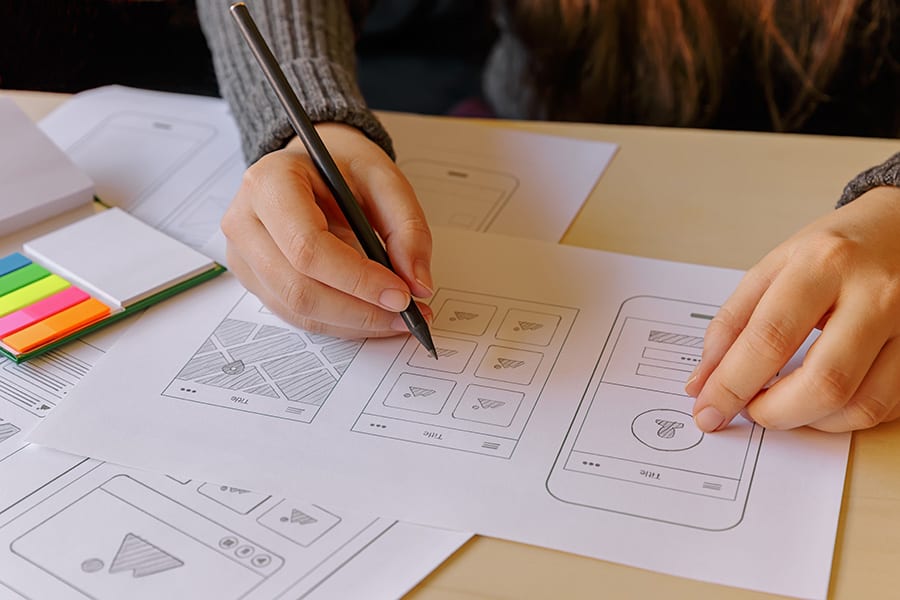
website design sketching framework uiux

“Did you find everything you were looking for today?”

It should be easy to find what you’re looking for. That applies whether it’s the product you pine for or the data you desire.

Just like a good SEO strategy, your user experience journey starts by focusing on the needs of the user.

Giving the customers what they want is a pretty good idea in business, full stop. But how do you know what they want from your website? You can start in four very simple ways.

  1. Asking your customers
  2. Seeing what questions you receive from the website
  3. Checking user flow in analytics
  4. Studying search data with search analytics report

Combining this knowledge will give you great insights into user intent.

  • Why are people visiting your website?
  • What are they hoping to find?
  • What are they looking to do?

This will not only enable you to deliver the right kind of content, but will also help you map out the journey through the website. ‘Findability’ isn’t just a search box, it’s about guided exploration.

Like VIP guests arriving on a Hawaiian island, visitors should be gently guided so that they can flow seamlessly through each phase. Flower necklaces, effortless check in, let us take your bags, there’s the watersports guy, cocktails at the bar.

viewing ecommerce website on laptop, trusted payment gateways, credit card

Ecommerce experience tips

Following on from findability, almost equally as important in terms of ecommerce is getting customers over the line. Here are five easy ecommerce tips to help improve this aspect of the online customer experience.

1. Transparent Delivery Charges

When you’re in the supermarket with a basket of groceries, you don’t tend to pop it down on the floor and walk out. That would be a bit bonkers. But people do this online. All the time.

And the #1 reason for cart abandonment? Adding extra costs at checkout.
Be as transparent about your delivery charges as possible. If you offer free delivery over £xx then place this message site wide in a prominent position.

Getting this right will encourage people to actually spend more with you, rather than dropping their basket. Learn more about how to set out your online store.

2. Click & Collect

Customers like to know an item is in stock before leaving home. They also don’t like to wait (or pay) for delivery. This explains why Click & Collect has become so popular.

Across all major retailers, over half are already offering Click & Collect, with many more planning to add it this year.

According to Internet Retailing magazine, more than 60% of Click & Collect shoppers go on to purchase further products during item collection.

3. Wishlist

Life’s not always black and white. The reason someone might remove an item from their basket could be down to a number of things. Often, it’s not a cold hearted change of mind, but instead it’s just not the right time.

By offering the ability to save the item, or add to wishlist, you provide an alternative that’s mutually beneficial.

You make it easier for the customer to return and buy the item at a later date. (This is also an acceptable reason to ask that they make an account). You also create a more casual browsing experience as wishlists subconsciously require less commitment than an ‘add to basket’ action.

4. Easy checkout

As well as appearing credible, it’s essential to make it as easy as possible for your customers to complete their purchase.

Forcing people to fill in boxes with their details in order to buy something is a major conversion killer. Reminiscent of those 80’s department stores that required you to have an account before buying from them. Remember them? No? Exactly!

So one of the most significant improvements you can make is to allow customers to checkout without requiring an account. You can always give them the option to create an account afterwards.

5. Thank you, come again

After the payment has been processed, you should redirect your customers to a page thanking them for their purchase. But don’t stop there, improve the customer experience by providing helpful links such as

  • What happens next
  • Create an account
  • Track my order
  • Product recommendations

Or make the most of this opportunity to interact with an engaged customer:

  • Make it easy for them to share their recent purchase on social media
  • Ask them to review their experience
  • Encourage newsletter signup or competition entry
  • Offer a limited time voucher on their next purchase

The best websites are never finished

They are living, growing things that need to be continually reviewed, updated and improved. Ask about how our concierge packages can help you to define the ultimate user experiences for your customers.

Find your nearest studio.

printed invitations

Foiled stamped flyers create a striking impression – stand out and strengthen your brand credibility.

Nettl.com of Liverpool incorporating printing.com take a thick 400gsm board, apply an ultra smooth luxury matt laminate finish and top it off with metallic gold or silver foil highlights. If you want to make an amazing impression and to stand out with something really special, then our Opuleaf Luxe Foiled Showcards are for you. Contact us today for your free samples.


Local businesses across the country are fighting back against the internet by providing customer experiences that simply cannot be delivered online. Stand out from the crowd and GET OUT there today.

Let office staff get more sunlight to make sure they’re getting enough vitamin D.

The Times recently reported that 91% of indoor workers had insufficient levels. The authors of the study involving 53,000 people suggested sunshine breaks during the working day would help address the issue.

Vitamin D is essential for healthy bones but that’s not all. There’s also a common belief that getting outdoors is beneficial to your overall health and wellbeing.

Ever felt fed up of being stuck indoors? Health experts coined the term ‘nature deficit disorder’ to describe the negative emotions caused by not spending enough time in the great outdoors.

On the flip side, when we do get to enjoy some time outside, feel-good neurons fire our brain that give us little rewards. This reduces stress and helps productivity, focus and creativity.

So what can you do about it?

man outside on phone drinking coffee

• Breakout

Outdoor breaks aren’t just for smokers. Encourage staff to use their breaks to get some fresh air. No need to stay put by the percolator. Make drinks to go.

• Dine al fresco

No dinner at the desks please. Create a welcoming and social space for co-workers to catch up over quinoa.

• Work al fresco

Laptops don’t belong on desks. It makes them sad. Set them free. Help them realise their full potential. Shady spots help tackle glare. Sorting the social schedule? Grab a couple of markers and a big sheet of paper and take it outside.

• Meet me outside

Make the boardroom table the picnic table. Take the meetings out of ‘the box’ to get more blue sky thinking. Breakout areas on the lawn are way better for brainstorming than the same four walls.

How can we help?

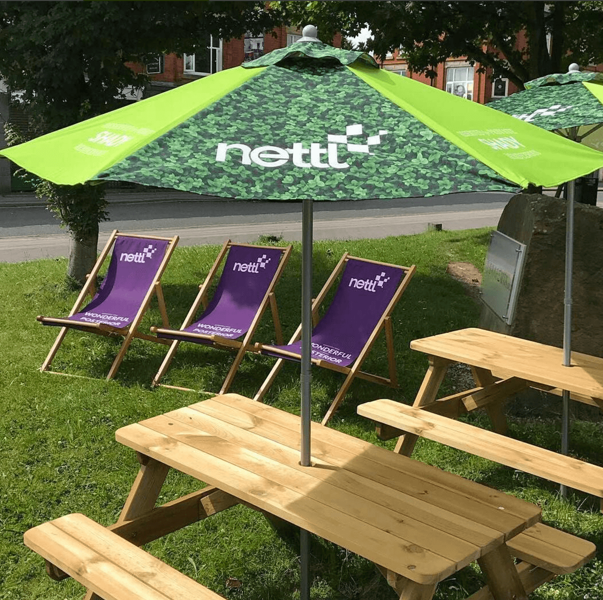
branded parasol umbrella and deckchair outside

Encourage workers to spend more time outside by creating the right environment. Check out our range of outdoor furniture by speaking to your local partner, downloading the fabric guide or finding ideas in the Summer Look Book.

You can customise the design with your logo, colours or images to help boost your brand and stay looking sharp.

Combine any mix of deckchairs, bean bags, tables, gazebos, flags and parasols to help stay safe when shade is needed.

Get started by talking to your local partner.

Be a great big brand strawberry. We’re all in business to attract attention and get picked. Right? The trick is making sure it’s us that customers want to pick. Find out how to get picked.

Nettl of Liverpool

On a regular basis here at Nettl of Liverpool, we’re still occasionally asked “what happened to Printing.com?” When you think about it, that’s kind of like asking “Where did Nettl of Liverpool come from?” Well, we’ll tell you!

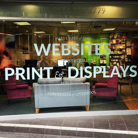
nettl of Liverpool studio image

Our business originally started in Liverpool under the aforementioned name of Printing.com, which was back in 2005 and as a two-person operation. At that time, our business focused solely on printing and design, providing professional material with an emphasis on high quality and eye-catching imagery for businesses of all sizes and sectors.

Based on Dale Street, one of the busiest streets within Liverpool’s business district, Printing.com quickly became a success, and was one of the more recognisable offices that people would see travelling in and out of the city centre over the next few years. However, as the world of technology changed with the growing importance of the internet, we had to change too, and so our evolution entered a key stage in 2015.

That year, we changed our name to Nettl, incorporating the Printing.com title since print and design remained a key part of our business strategy. However, these services were joined by website design and web development, ensuring that we could cater to the many SMEs in and around the region who require a first-class functional website at an affordable price. This would also lend itself into similar web options such as ecommerce and online booking. This was a crucial time for us, as it allowed us to expand beyond our previous reach, as well as encountering new, exciting opportunities.

In February 2016, we added another service in the form of exhibition design, in particular fabric exhibition stands, which allows ambitious companies to make a bigger impact at networking events and business conferences. The increased range of services necessitated the growth of our team of experts, which now includes Peter (managing director), Thomas, Emma and Stephanie. We have now been around for twelve years, remaining at our prominent office on Dale Street, and it’s been a remarkable journey thus far.

So, for those who still ask us “What happened to Printing.com?”, the answer is: we evolved, and we became the larger, busier and more prominent Nettl. We still offer print and design, but we offer many other equally-vital services for businesses too. And whilst it’s been a great ride so far, we’re even more excited about what the future brings, as we look towards the next step in the evolution of Nettl!

Getting the most from selling online

Part one: Merchandising your online store

As more and more people get in the e-commerce action it’s important to remember how it all started. Shops and stores showcased their products, built their reputation, looked after their customer base and spread the word.

Although as technology and behaviour changes, and a whopping £133bn a year is spent online, has the philosophy behind retail success really changed at all? Or have popular e-commerce stores taken the essence of what works on the high street and simply delivered these values online?

It may seem like a whole new ballgame but the principles of our offline shopping experience remain steadfast in our experiences online. Utilising these principles in the online world will help you get the most from your website:

  1. Merchandising your online store
  2. Credibility and trust
  3. Customer experience
  4. Making yourself known

Merchandising your online store

Seeing as your product is the star of the show, today we’re going to start with #1, merchandising your online store. Let’s begin by checking off some important tips to help you showcase your swag.

Real world example of e-commerce merchandising done well

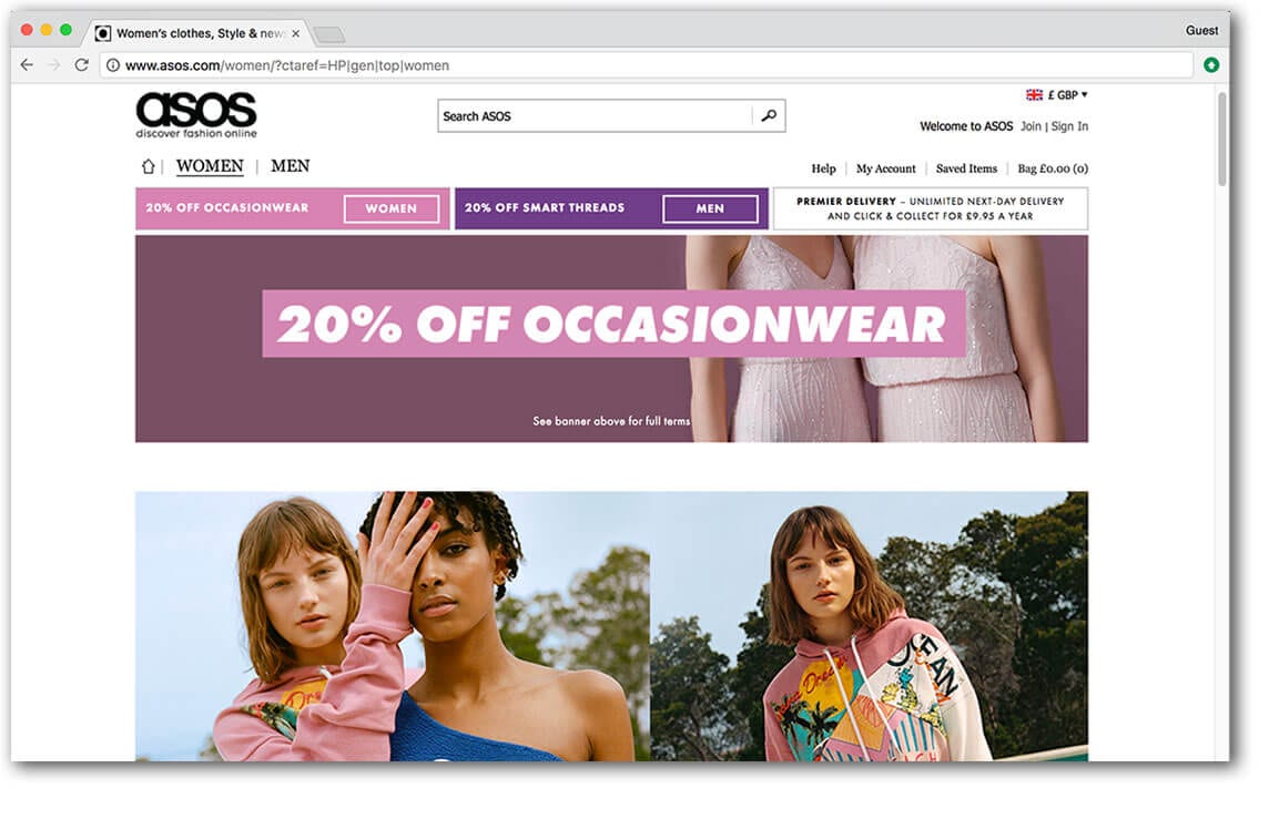
merchandising online store best exampleOnline fashion retailer asos.com do pretty much everything right. The site is oozing with aspirational lifestyle images, detailed glamorous product images and cat walk videos.

On the one hand they face a significant challenge. After all, traditionally people like to browse a store and try clothes on. But on the other hand, they have the advantage of tapping into an emotive subject, fashion. Or even deeper, public perception and self image.

How important is photography to my webshop?

ecommerce product photography

When you’re in a real shop, you see the item how it is. Not a small blurry version of it. Seeing is believing. So a lot of effort needs to go into reproducing that visual experience.

You’ve been on gumtree or eBay. The items with the best and most photos stand out. The ropey photos make you think twice. So it’s no surprise that e-commerce sites with great product images outperform ones without.

Good photography improves the perceived quality of your product, can communicate lifestyle values and increase how credible and trustworthy your site appears. We suggest you get a professional photographer to help. It’ll be a smart investment long term. You can use the photos in your marketing, as well as on your product pages.

We can arrange professional photography for you or make a local recommendation. However, if you do not have the budget available right now, you can always shoot the images yourself. Just be sure to consider your lighting and backdrop. Whether you’re using your smartphone or a decent camera, set up a mini studio. Use a tripod, lamp and studio tent. Aim for good light, contrast and consistency. No blurry images, kitchens, bathrooms or unrelated objects in sight!

What product descriptions work well?

Paint a picture. Quality product descriptions help get the sale over the line. They are also very useful for search engines. So your goal is to have words that not only describe the product, but go beyond that.

Sure, list the features, but what are the benefits?
What problem does the item solve? How does it make you feel?

The ‘feature’ of a toy product might be ‘batteries included’. The benefit is that the child can start playing with the toy straight away. Avoids the tears from disappointed littl’uns. Avoids frowning parents making an impromptu dash to the shops.

Tell stories about the product and use words that describe how it sounds, smells, feels, looks. These things will all help elicit an emotional response from the reader.

Scattered throughout this explanation should be a few choice keywords, for search reasons. But it’s important this sounds natural, like a real person would actually say it. No broken English or robotic sounding phrases – this will just put your buyer off.

When you walk around a shop, you don’t read every bit of information, it’s impossible. You scan for bitesize info that you can quickly act upon. This applies online too. So Use headlines, subheadings and bullet points within your description to make your text easier to pick out and absorb.

Does my e-commerce site need product reviews?

It helps, yes. Social proof. Just like in the real world, people are way more likely to believe what someone else has said about a product over what you’ve said yourself.

Especially if that someone has already bought and received the item. Did you know, 61% of customers read online reviews before making a purchase decision?

And if people are on the fence between a couple of options, they’re likely to go for the one with the most positive reviews. In fact, 50 or more reviews per product can lead to a 4.6 increase in sales.

What other information will help people buy?

It’s summer, you want to get fit and spend more time with the family. So find yourself meandering round a bicycle shop scouting for bikes for the family. It’s understandable that you might want some advice to help you decide what bikes suit you best.

Online, in the absence of a smiling sales assistant, your web shop needs to compensate by offering useful guides matched to expected customer queries.

In this instance, you’ll want to have content that explains what type of bike suits your usage, and especially a size guide. Content might be articles, illustrations or videos and could cover things like:

  1. FAQs,
  2. Size guides,
  3. Comparisons,
  4. Performance charts,
  5. Instructions,
  6. Assembly guides (if it’s simple!)

What type of video drives e-commerce sales?

video content ecommerce sales

Have you heard of the term ‘showrooming’? That’s where potential buyers peruse the high street shop to browse before hitting the internet to find the best deal online.

But reverse showrooming, or ‘webrooming’, occurs when customers browse online but head to a bricks and mortar shop to complete their purchase. There is an increased risk of this when your website either fails to provide enough information about the product. Or the consumers desire to see the product in action isn’t met.

There’s no better substitute for actually being there than video. Until AR/VR takes over then it’s the best thing we’ve got to demonstrate what the product looks like and how it’s used. Videos that showcase product dimensions, as well as product functionality tend to be really helpful.

Ultimately, it’s good to have video because tests show product videos help sell more.
What’s more,

  • 71% of shoppers think video explains the product better
  • 58% think companies with product videos are more trustworthy

It doesn’t have to be complicated or expensive. The videos on asos.com are simple but effective. They film the model wearing the clothes marching glamorously onto the set, ready to take the photos. Two birds, one stone.

As a guide shorter videos work best. But although reviews are generally a good thing, research has shown that videos of someone reviewing a product, tended to be a flop with the audience.

How can I design my website to upsell more products?

web design grouping products online for ecommerce sales

In stores, product placement is important. Items are often grouped together or advertised as a bundle. Coffee pods by the coffee machines, matching bathroom decor, a discount on shaving products with purchase of razor, that sort of thing.

Plus we are bombarded with last minute impulse buys. Whether it’s batteries by the conveyor belt or the friendly sales assistant on the till. How often have you been asked to consider something extra that you hadn’t originally put in your basket? We heard about one petrol station asking their customers if they’d be interested in the chewing gum deal. Possibly a bit rude. Gum, anyone?

But it works and that’s why they do it. Your website can do this even better, because it can offer a never-ending array of products to you, without getting annoying. Imagine someone at the checkout offering you one product after another, how annoying. And yet your website can display dozens of products throughout the customer journey. As you browse the pages, as you add items to your wishlist and basket, it can follow you around saying “Wow, great choice. Why not get this with it? Other customers bought them together you know.”

What makes an effective webshop category page?

Supermarkets and department stores organise their goods into sections, aisles and departments, so shoppers can make better sense of it all. It helps people find what they want quickly, immerses them in a relevant environment, and adds an element of control to the customer journey.

This is where your category pages come in. They add structure, navigation, enjoyment and momentum to the shoppers journey.

Good category pages will introduce shoppers to subcategories, holding their hand through the journey and guiding them effortlessly to the products they are looking for.

Make sure you use enticing images and descriptions. They will be useful and reassuring for your visitors and also a great place to put your key search terms, ready for those googlebots to find.

Include a customer service bar at the top to build trust. This section could feature a phone number, free delivery message and hassle free returns badge. Don’t overload it with too much info, just enough to reassure the buyer and nudge them along.

How can I keep on top of stock control?

High street stores have limited space. Efficient stock control is the key to having the right amount of stock in the right place, maximising the opportunity for sales.

Most ecommerce platforms have systems in place to help you stay in control of stock levels. But what if you have a physical shop too? How can your till, website, and inventory software keep talking to maintain a healthy stress-free relationship?

If you have an epos now or datasym system, we can help connect your website to your epos equipment and automatically synchronise stock levels between your web shop and your retail stock.

  • We’ll import your products from your system
  • Review products, add images and detailed descriptions
  • Sync your stock levels automatically
  • When you sell an item, the stock on your till is automatically updated
  • Get paid into your merchant account and process the order
  • Despatch or allow ‘click and collect’ and send email notifications to clients

Contact your local studio to get started.


So you see, the values embedded in successful bricks and mortar retail can be harnessed to great effect online, where the potential for sales is greater.

Hope you found part one useful. Coming next, part two, building trust.
But for now, in the words of retail, ‘Thanks, please come again’.

1. The curse of the ill positioned fold
If you’re going to have a large headline or name crossing a fold on your campaign leaflet, try it out before you print 500,000 of them.

2. The “Edstone”
The stone containing Labour’s manifesto became a source of near universal ridicule. It was compared to the stone tablets in the story of Moses and the Ten Commandments, and to a cemetery headstone. In a matter of hours Twitter users had declared it the “EdStone”.

Edstone

3. Bringing Germany to England
Beware of using stock photography. The green fields and rolling hills were actually photographed outside the German city of Weimar, birthplace of the famously doomed 20th Century government, defined by economic catastrophe and subsequently replaced by the Nazi party.

4. Don’t contradict yourself.
Voters won’t take you seriously if you don’t have a clear message.

4. David Cameron forgets which football team he pretends to support
During a speech on diversity, David Cameron accidentally dubbed himself a West Ham fan despite normally claiming to support Aston Villa. That was awkward.

6. Ukip loses election because candidate didn’t spell party name correctly
It is believed the Ukip hopeful, who has not been identified, wrote ‘UKIP’ as the name of their party on the paperwork. Strict Electoral Commission rules state the candidate should have written ‘UK Independence Party’, as the name of the party must be written in full. As a result, Labour’s Liz Smith won the election by default with a grand total of zero votes.

7. The bigoted woman
Gordon Brown is overheard describing an exchange he had with a female voter as a “disaster” and calling her a “bigoted woman”.

8. Is your message ambiguous?
Get a second opinion before you commit to a design layout to make sure it can’t be interpreted in an unfortunate way!

9. Make yourself look friendly.
If you’re using a photograph of yourself on your election marketing, make sure it doesn’t scare away the voters.

10. Always check your spelling and grammar.
Obviously.

11. Beware of placeholder text.
It’s best if you replace these bits with your own words.

12. Vote Name Surname.

Having the candidate’s name on any promotional material is quite important

Kate Roughly, a recent Graphic Design and Multimedia graduate, shares her thoughts on joining our Nettl Academy as a Nettl Cadet.

When I started at the Nettl academy, I felt nervous and excited. I graduated from the University of Worcester last November after finishing my course in May. I have missed designing every day since I finished, and I grabbed the chance to design again at the Nettl Academy.

I travelled down to Birmingham on the first day and felt welcome as soon as I arrived. I met the other designers on the course and we all soon broke the ice and got chatting. I’ve been working full time in retail since I left university so it was great to be around other designers again in this atmosphere.

Chris and Simon who have been leading the course are great at teaching and really friendly too. I love being able to learn again. We have been focussing on web design on the course and learning about Brambl and WordPress. I didn’t do much web design during my time at university so I was looking forward to this chance to learn new skills as a designer.

We began with a group task which was really fun, we were given a brief then had to talk it through, create a launch project for a juice bar and then show our work to the rest of the group. This was nice to start off with and I enjoyed all of it. Even presenting at the end, which I never thought I’d miss!

We then learnt how to use Brambl, a platform Nettl have to make web design more efficient. I’ve only ever used code before which I found difficult and Brambl is much more visual which I definitely prefer. Being able to build the website panel by panel and adjust it visually is easier for me.

classroom training in great room training room birmingham nettl academy

After that we looked at WordPress which is a little harder to use than Brambl. Brambl is great but quite simple, whereas WordPress gives more freedom to me as a designer. Being able to use plug-ins, its free to use by anyone, and CSS code can be added to personalise the site even more. I prefer WordPress out of the two platforms as even though it is harder to use, I know that I can still learn how to use it well and then have more freedom with my design work.

We have been given a brief from The Printing Charity and as a group, we are all redesigning their current website individually. This is such a fantastic opportunity as I get to design again and work with a client. The Printing Charity wants a fresh new website that is clearer and easier to follow so the audience can find out what the charity does and how it helps people, as well as letting them donate if they want to.

So far I’ve redesigned the home page for the site and kept it clean and simple, using images of the people involved to help the user connect more with the charity and I’ve stuck to the colours that are already being used. These colours are really bold and look great on screen, it gives the website much more of an impact. I can’t wait to redesign the whole website which will hopefully lead to more opportunities.

I’ve been really enjoying my time at Nettl so far and getting to work with such a great company of creatives. I’m getting to grow each week as a designer and learn new skills which I’m really grateful for.

The Nettl Academy recently opened it’s doors to welcome the first batch of Nettl Cadets onto the training programme. The Nettl Academy is a way for design graduates to gain some experience, get on-the-job coaching and real-world training.

nettl cadets academy launch web training group photo

Could you cut it at Cadets?

If you’re a design student, or you know one, we are looking for applicants for next term.

Click to find our more about the Nettl Academy or enrol.

After graduating with a degree in Illustration and Animation, Sean Comrie heard about a ‘cool design experience opportunity’ on the horizon. Welcome aboard the Nettl Academy, Sean. Give us your thoughts on becoming one of our first Nettl Cadets.

“I had spent a couple months working a typical supermarket job whilst desperately trying to find some kind of creative inspiration, admittedly more days spent not designing at all and just focusing on working a very normal job. So hearing of an opportunity where I would get to learn some design skills and get real life design brief experience to me felt like a total win, as at university I had never really experienced doing any commissioned-style projects because that was more catered for the Illustration Graphics/Fine Art students.

Initially, I was very nervous, as I thought maybe I’d lost my edge. I hadn’t designed anything to show others in a while. My projects prior to starting had very much been private and mainly unfinished. But everyone at Nettl put me at ease because they are very friendly and it almost feels like a little family relationship rather than just serious business.

The lessons on web design run at a good pace and are made easy to keep up with, especially for someone like myself with zero experience in web design. After the first couple of sessions using their in-house web design software, Brambl and WordPress, I am slowly getting a better grip of designing for web.

I understand the things required to make an appealing and successful website. In addition to this, the critiques after the sometimes one-day deadline projects are very helpful as they get you thinking of where you can improve and practice quick thinking and execution.

sean critiquing a website design

During these projects you also get to work with some of the other cadets. It’s a nice experience meeting new people from different places, much like university again, which is something I really enjoy.

Over the last week I was challenged to create two logo designs for two different types of companies which is something brand new to me as normally logo design is out of my field. But doing this was great fun and I feel like it’s eventually something I will be able to say is part of my designers repertoire.

As I continue through this programme I hope to continue honing such skills and develop others.

The Nettl Academy recently opened it’s doors to welcome the first batch of Nettl Cadets onto the training programme. The Nettl Academy is a way for design graduates to gain some experience, get on-the-job coaching and real-world training.

Could you cut it at Cadets?

If you’re a design student, or you know one, we are looking for applicants for next term.

Click to find our more about the Nettl Academy or enrol.

nettl cadets academy launch web training group photo