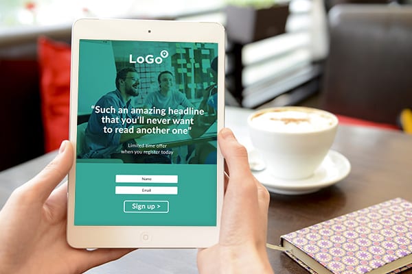
Landing pages are used by businesses just like yours to increase website conversions.
While there is perhaps no such thing as a perfect landing page, there are many things that can derail performance.
So we’ve put together a list of 5 landing page mistakes that might’ve stifled your success, if you didn’t know what to look out for.
But first, what’s a landing page?
Well, to begin, it’s not your homepage. It’s not even a page about the specific product or service you offer.
A landing page is a page on your site (or perhaps a standalone one-page website) that is specifically designed to do one thing. Convert.
What’s a conversion?
No, silly, it’s not a modified classic hot-rod campervan.
We’re talking about the successful completion of a particular action by your website visitor.
That could be any number of things, but typically involves a form or a button at some stage.
Popular conversions could be something like:
- Buying a product
- Ordering free samples
- Click to call
- Call back requests
- Newsletter signups
- Form submissions
- Barn duplex with indoor waterfall and disco floor
OK, we slipped that last one in just to keep you on your toes.
Whatever your goal, your landing page should be totally focused upon that one outcome. Which leads us delightfully onto landing page mistake #1…
#1. Too many distractions
In the real world, when you arrive somewhere, you instantly scan your surroundings for things that will help you decide where to go and what to do next. It’s the same online, so we need to make this as easy as possible for our new guest.
Removing distractions and unnecessary clutter will minimise options and help guide the way. Reduce text to a minimum to avoid users getting sidetracked and remove any links. Change the page layout to hide menus and sidebars, so that the only action available is the one you have chosen. Your visitor then has only two options: complete the step, or leave. Limiting the choices like this will lead to increased conversion rates.
#2. Lame headlines
Times change quickly, but human behaviour, less so. Just like in a newspaper (Ask your folks, kids), the headline is the most important part of the page. It’s the bit everyone reads and easily the most important part of your landing page.
It should captivate interest with the benefits on offer rather than a boring descriptive title. The challenge is creating a headline that is compelling but also concise. Remember, the goal is to ‘sell the next step’. What’s the next step on your landing page? Is your headline be persuasive enough? Remember to split test your headlines to make sure you’re using the optimum ones. Really. It’s that important.
#3. Confusing ‘Call To Action’ (CTA)
If the purpose of a page is to encourage the user to do one specific thing, then it may seem obvious to say you should make that very clear. But many unsuccessful landing pages lose sight of this, making things difficult for the visitor. Want to encourage somebody to do something? Reduce friction. Make it easy.
Buttons should be large, clear and prominent and there should only be one. If there are multiple options, the user has to decide. And just the act of having to make a decision, no matter how simple, can be enough to put a bump in the road. Forms should be limited to the very minimum amount of information needed. Asking people to fill in too much information is a sure-fire conversion killer.
#4. Not testing
It’s easy to tell if something’s working. You drive traffic to the page and see if you get a bite. But how do you know if something is working as well as it possibly can? The only way is by testing. Making design choices to optimise your page based on the data can really supercharge your campaign results.
You can test everything about the page to see what leads to, well, more leads. Different headlines, copy, images, videos, testimonials. If you have buttons, it’s worth testing both the text on the buttons and the colour. You can even test alternative layout designs. If you’re serious about conversions, you’ll have multiple landing page designs so that you can compare results.
#5. Not promoting
You can have the best landing page in the world. Stunning design, awesome headline, compelling offer, clickedy click click, no brainer. But it will fail miserably if you’re not sending enough traffic there in the first place. If your website attracts a lot of visits already, then links from your site may be a viable option. But most businesses will want to push for more.
Landing pages aren’t generally optimised for SEO so traffic often arrives from a different source. Ads are a popular source of traffic, whether from search engines like Google, or social media apps like Facebook, Instagram and Twitter. Email marketing is an extremely effective way to send qualified targeted traffic to your page. And in a world where online juggernauts such as Google, eBay and Amazon still send you stuff in the post, you certainly shouldn’t ignore the impact direct mail can have.
Seems like a lot of work
Landing pages are powerful sales tools, but they can seem daunting to manage effectively. Designing professional layouts featuring quality content, testing multiple options, and driving traffic through consistent marketing is time consuming. It can be overwhelming when you have a business to run.
The good news is that we’re here to help. We can design optimised pages, manage campaigns and drive traffic to your landing page. Get in touch with your local studio today to talk ideas.


