Target HR
by Nettl of Stamford & Bourne
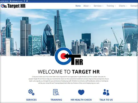
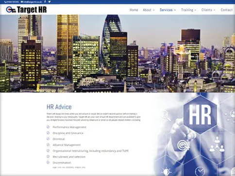
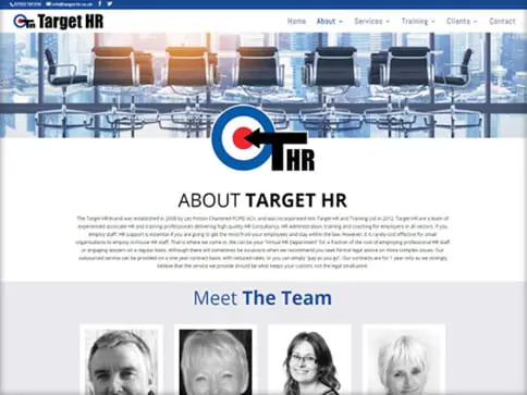
The clients previous site had very confusing navigation, finding anything was quite difficult and not obvious. So our key focus here was to improve on that navigation whilst updating the visual elements of the site so it was more engaging and welcoming. We rearranged a lot of the content and were able to drop old unnecessary elements so we could get the navigation of the site how it should be. We revised the aesthetic to give a clean contemporary modern feel and with the inclusion of the online training courses this site will work a lot better and offers much more for the end user.
We evolved the original website to a more practical, easy to use responsive site that works visually and practically. Our client was very happy with the end result and the huge leap between the two websites.


