approx 5 minute read
Why lean, open-plan office styling is bad for productivity and how to fix them
Let’s clear this up. ‘Sick’ as in unhealthy. Not ‘sick’ as in cool. But actually, thinking about it, it doesn’t take much to turn a sick (vomit) office into a sick (wicked) office.
There’s been a trend for lean, open-plan office styling. These sanitised spaces are designed to avoid distraction and let staff just get on with their work. Some businesses even enforce clear desk policies, banning personal stuff from cluttering up their employee’s focus.
But, there isn’t a single branch of science which proves this makes workers happier or boosts productivity. So is it sanitised or insanity?
University of Exeter’s Dr Knight has been studying the psychology of working environments for 12 years. His study asked participants to work in four different office spaces.
First was lean, with only things needed for the task. Second was enriched, with art and plants already arranged. Next had the same art and plants, but the participant was empowered to arrange them. In the last space, the participant was told to arrange the plants and art, but the experimenter disempowered them by reverting their changes back to the enriched layout.
The study found people worked 15% quicker in the enriched office styling than the lean office and had fewer health complaints. This rate doubled for people working in the empowered office styling. Yet for those people who had their personal touches interfered with, disempowered productivity levels were the same as the lean office.
That’s pretty clear. A workspace enriched with art is better for productivity. Far from being a distraction, art can actually boost wellbeing and reduce stress. And when your team is involved in the selection and design process, even better. So can you just hang generic “There’s no I in team” posters and put up those hilarious motivational “Keep calm and carry on” messages? No, his research shows they don’t work. At all. Sorry not sorry.
A study by Oxford Economics has also proved what we all thought – open-plan offices lower both output and morale.
Whilst open-plan working has been around for ages, back in the fifties, a small group of consultants from Hamburg tried to create a more collaborative environment. They sat people in clusters in the same room, separated by screens and plants. It caught on and soon open-plan was everywhere. But it quickly evolved into a race to cram as many people into a space as possible, in tight rows of cubicles, with little diversity.
Now, open-plan office styling is fading in popularity, particularly as millennials march towards being the dominant generation in the workplace. They put a premium on comfort and time efficiency. According to Oxford Economics, over half of millennials complained about noisy open-plan offices and desired uninterrupted work time.
Isolation isn’t the key – companies like Pixar and Google attribute their success to having collaborative close working. Placing people in close proximity leads to more idea-sharing. So what’s the solution?
People work differently than they used to. With wi-fi, smartphones, tablets and laptops, the tools of work are smaller and you can be more fluid about where you base yourself. There’s now an understanding that different tasks benefit from different spaces. Office design is moving towards creating different zones for different activities.
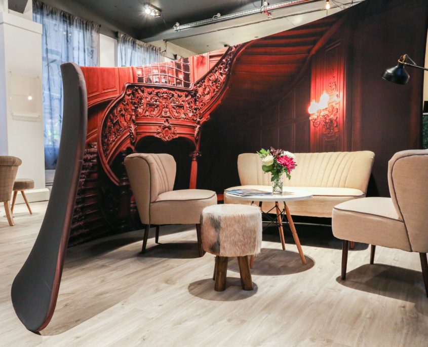
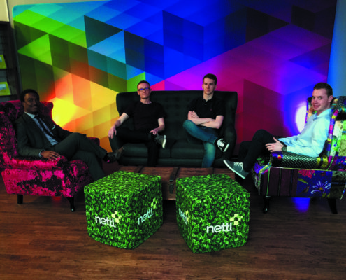
If you ignore sleeping, many of us spend more time at work than home. That’s why there’s a growing trend towards making work more like home. Using domestic furniture, making people feel more comfortable. Clusters of sofas encourage this collaboration, whilst pods and booths allow quiet solitary work.
Do you sometimes go to the park or an art gallery to relax? To tune out. To seek solace or inspiration? Zoning out is important. A little distraction is healthy. Art has always been an escape. Problems are seldom solved staring at a computer screen, next to Colin munching on an egg mayo sandwich. They’re solved by your subconscious. By allowing your mind to wander. Things become clear.
A generic environment isn’t good for happiness or creativity. By making a place more human-friendly, the best employers are aiming to retain talent and foster inspiration and ingenuity.
But buying massive works of art is beyond the budget of many businesses. So is it possible to pimp your office on a budget of a couple of grand? Yes.
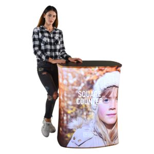
New technology is driving this change. It’s now possible to cost-effectively print direct-to-fabric, like never before. An industry has emerged, making it easy to create enormous screens and booths. We offer a whole range of low-cost fabric furniture and display ideas.
Businesses are beginning to see the potential of personalising their workspace, of tailoring their environment to suit their brand, their culture and inspire their teams. Designers are opening their eyes to the possibilities that ink-on-fabric opens up.
From room dividers and meeting booths, to pop-up cocktail tables and cube stools. You could even get creative with printed gazebos, large beanbags and curved backdrops.
We’re seeing businesses using our curved booths to make meeting spaces in the corner of the room. We particularly like the faux log cabin, complete with faux cow-hide foot stools. Others have done beach huts and ice cream trucks. You can let your imagination run riot. Turn an office in Tauranga into a Tiki Bar. Put an igloo in Invercargill. A rainforest in Rotorua. A palace in Palmerston North. If you can think it, we can make it in fabric.
Break up larger rooms with 3m wide screens. Print some abstract art or an enormous panoramic photograph to spark critical thinking. The great thing is, there are no panels to try to line up – create large one-piece, continuous graphics.
Dr Knight’s survey shows that empowering your team to design a more creative, zoned workspace could make them more 30% more productive. This all starts to make economic sense. What would that 30% do to your bottom line? Let’s get to work.
How the fabric range works…
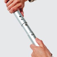
There’s a common theme to the range. Each item usually comes in two parts – a portable lightweight frame.
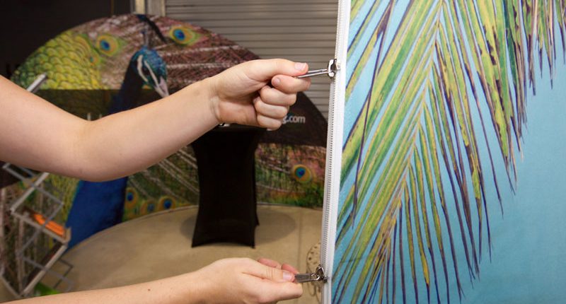
Then there’s a fabric printed cover, which usually stretches over the frame. The cover can be entirely personalised in high-definition full colour. Imagine a printed stretchy duvet. Pull it over the frame and zip it up. That means it’s easy to change the graphic in a few minutes or to refresh it every few months.
Interested in more ideas on how to market your business?
Download our digital Print and Marketing Ideas magazine or pop into your local Nettl studio and ask them about how we can help your business with our awesome print and marketing ideas!

